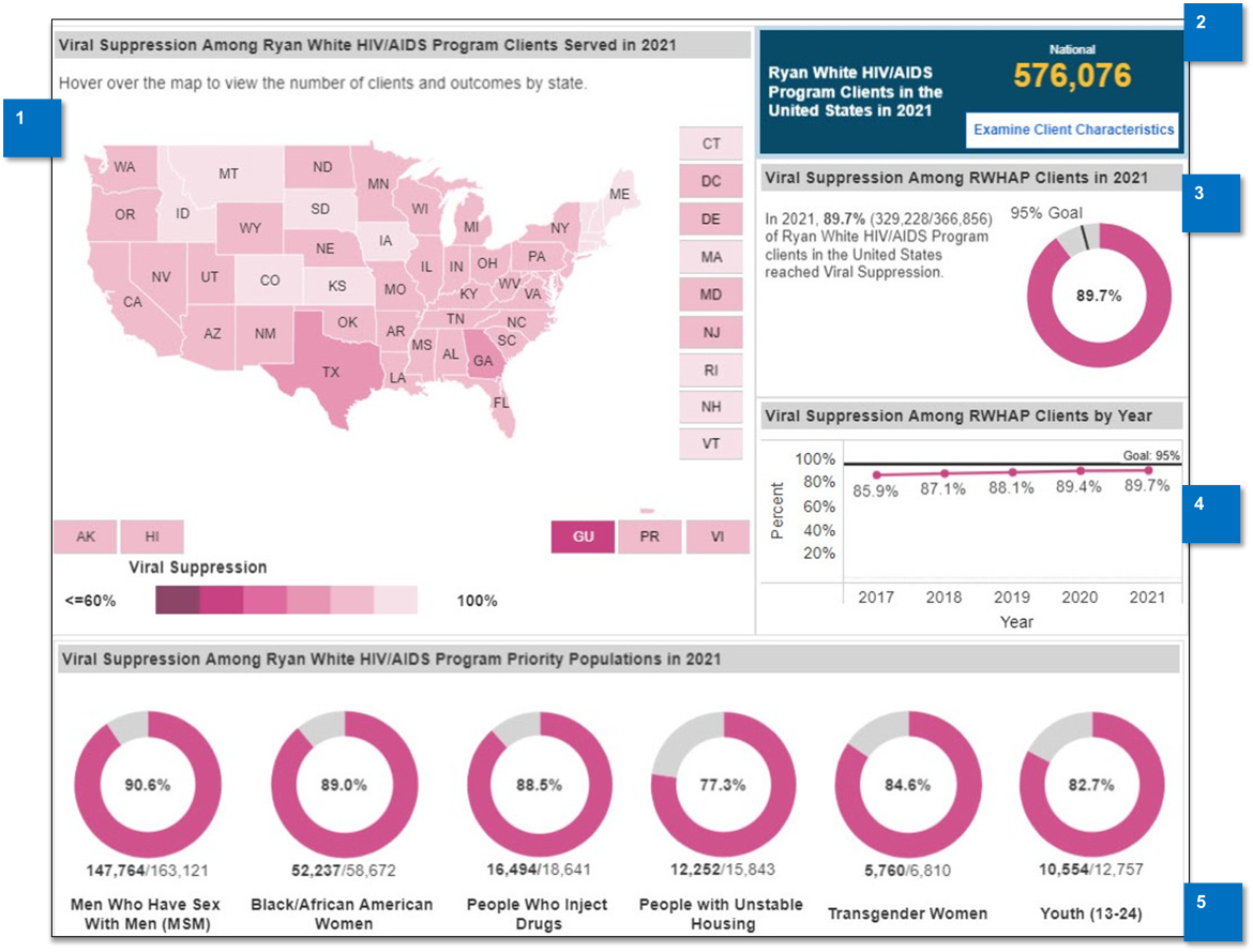
This screen (see Figure 3) displays client outcome data for viral suppression and retention in care. You can view national, state, or metropolitan area data.
The initial view shows the most recent national data for viral suppression.
Figure 3
-
Outcome Measure Map
This map provides state-level information about the selected outcome measure. Darker colors represent lower viral suppression rates, and lighter colors represent higher viral suppression rates. -
RWHAP Program Clients Summary
This presents the number of RWHAP clients served in the selected location. -
Outcome Measure Summary
The outcome measures indicate the number of clients who meet the selected outcome criteria compared to the total number of clients who meet the denominator inclusion criteria. When looking at state or metropolitan area data, national data is provided for comparison. Percentages for these data are also displayed.
The donut chart shows the percentage of clients meeting the outcome measure compared to the national goals for the selected outcome measure. -
Outcome Measure among RWHAP Clients by Year
This graph shows the percentage of clients who meet the outcome measure over a five-year period. The goal for this outcome measure is also provided on the graph. -
Outcome Measure among Priority Populations
The donut charts show the selected outcome measure for several priority populations. This number is derived from the total number of clients who achieved the specified outcome and the total number of clients within the priority population who meet the denominator inclusion criteria.